Scope of work
Strategy
UX research
Concepts
Rebranding
Content Definition
UX/UI Design
Development
SEO
The Mental Craft is a team of four young and enthusiastic psychologists specialized in eSports psychology, who have been helping both individual gamers and teams to level up their performance by overcoming mental barriers.
We collaborated with The Mental Craft to create a unique online solution where eSports meets brain science in order to help gamers to reach new heights of their performance.

01
The challenge: Reconciling gamers and psychology (a tough one, right?)
Mental health is a taboo subject in many layers of our society. The Mental Craft wanted to bring closer psychology to eSports players and challenge the taboo of their mental health:
- by emphasizing the importance of physical and psychological health on gamers’ performance, and
- by educating them on the necessity of mental training besides mechanical superiority and game knowledge.
They needed channels to grow a gaming community and encourage eSports players to interact, but also to attract other enthusiasts to join them and contribute by writting and speaking on this topic.
TMC also wanted to present their services and to bring out their perennial experience and knowledge gained through coaching a wide range of gamers from professional individuals to top-level eSports teams such as Fnatic, Misfits, Red Star, etc.
02
Rebrending: Telling the same story, only more vibrant
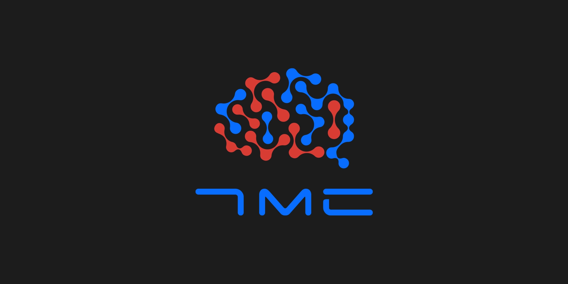
The Mental Craft already had their logo that we wanted to keep that way, only change it slightly, for two reasons:
- we believed that symbols of connected neurons forming a brain send a clear message of what TMC is doing, and
- TMC already had a gaming community around them who recognized them for their logo.
However, we thought that colors and proportions should be redesigned.
Existing shades of red and blue were pale, without identity, and with no association with the gaming industry. So we chose shades that gamers can identify and connect with.

03
Color palette: The mystical colors of gaming
Through the research of the gaming world, and as we're gamers, we concluded:
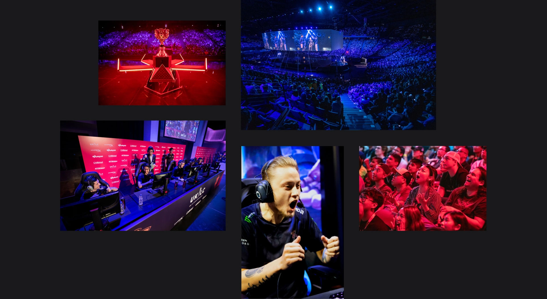
Gaming is a world of rapid reflexes, mystical darkness, vibrant colors, turbulent emotions, visual sensations, strong sound, and visual stimulations, energy, and fight.
So we wanted to implement all of the above into TMC's new visual identity because the existing coloring wasn't one that gamers can relate to.

04
Colorful storytelling - a story of blood, sweat, and tears
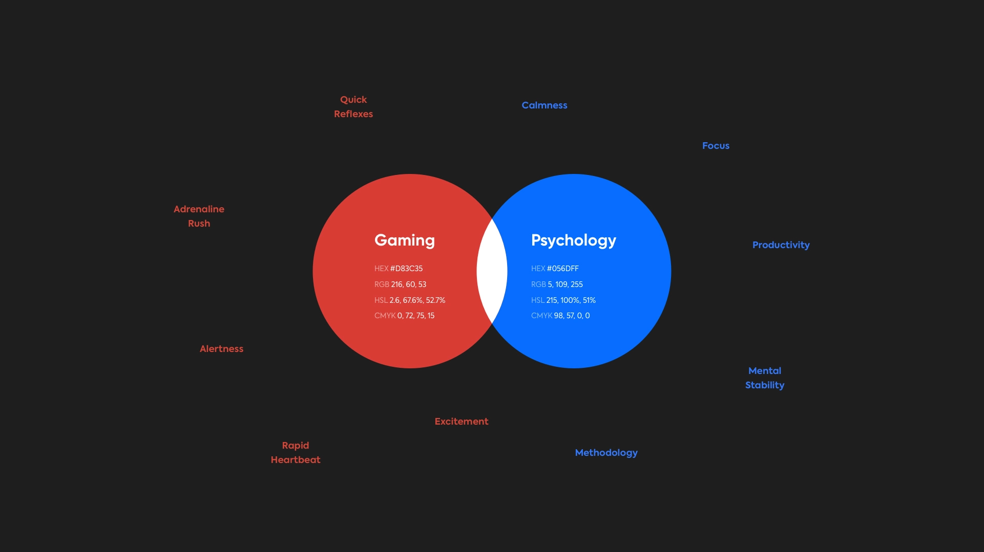
By creating a brand persona and by reconsidering their values, we realized that gamers are
- impulsive
- have quick reflexes
- under contant adrenalin rush
- always alert and ready for fighting.
Red was a natural choice in this scenario and in the logo because it stimulates senses, body, and mind, raises blood circulation, and creates a state of excitement and tension.
Blue has the opposite effect.
It makes a person
- calm and relaxed,
- gives stability and reliability,
- lowers puls and body temperature
- and makes a person focused, systematic and productive.
This color has the impact on person similar as psychologist has on client, therefore blue in the logo symbolizes psychology.
According to color psychology red and blue combined increase physical energy. In the logo those two colors are like yin and yang - they reconcile gaming and psychology, which were thought as incompatible until yesterday, but today, when gamers finally understand they can enhance their performance with the psychologist's help, those are two inseparable things in the professional gaming industry.

05
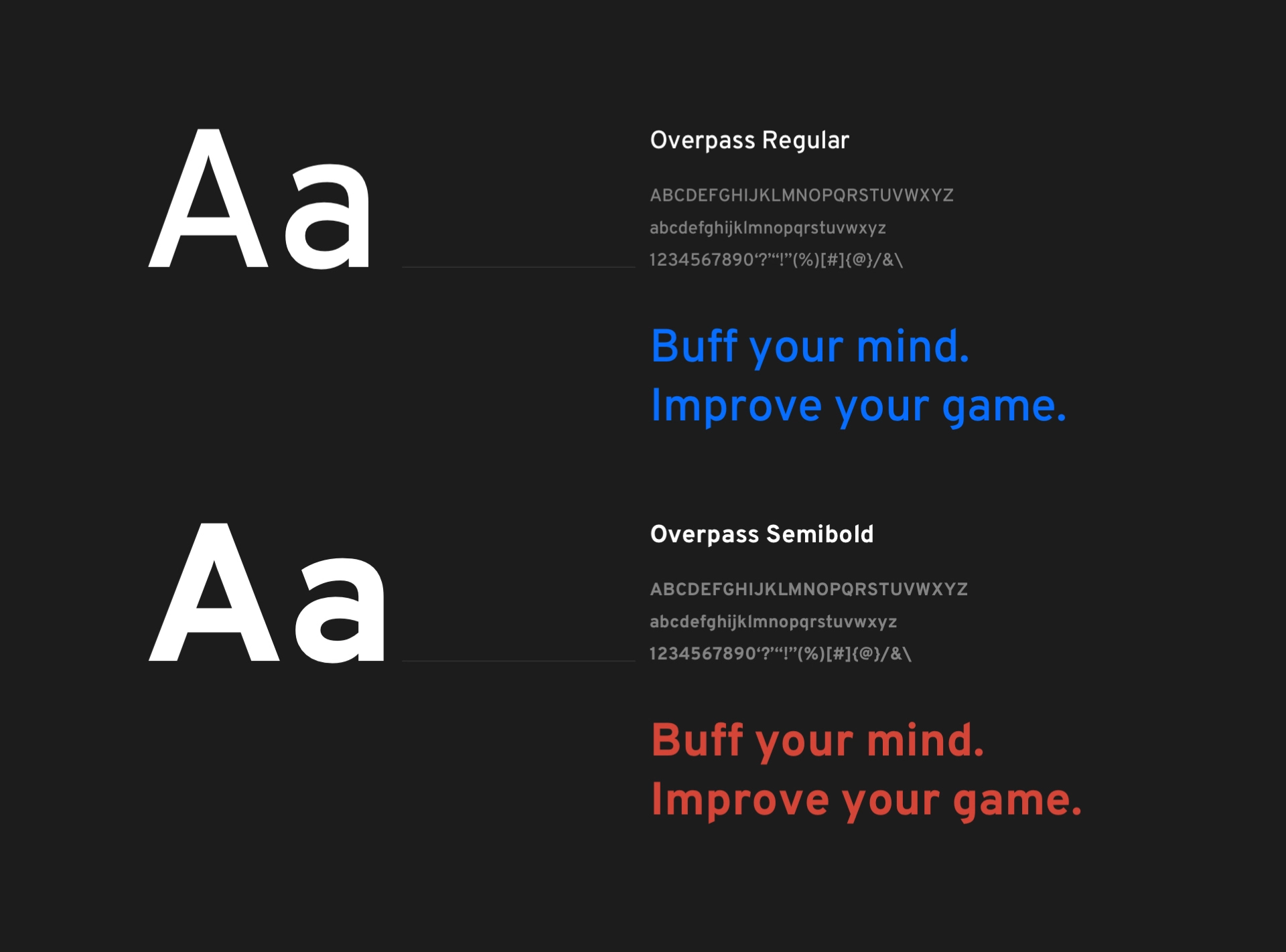
Typography: Overpass for speed, movement, and excitement
We took care of typography as one of the key features of branding.
Having in mind that writing is a significant aspect in TMC’s case, especially thanks to a blog section on their website, we took special care of font selection.
It was utterly important to choose typography that is easily readable.
On the other hand, we wanted to choose a font that will reflect gaming aesthetics. Therefore, we opted for Overpass, whose cut edges indicate speed, movement, and excitement.


06
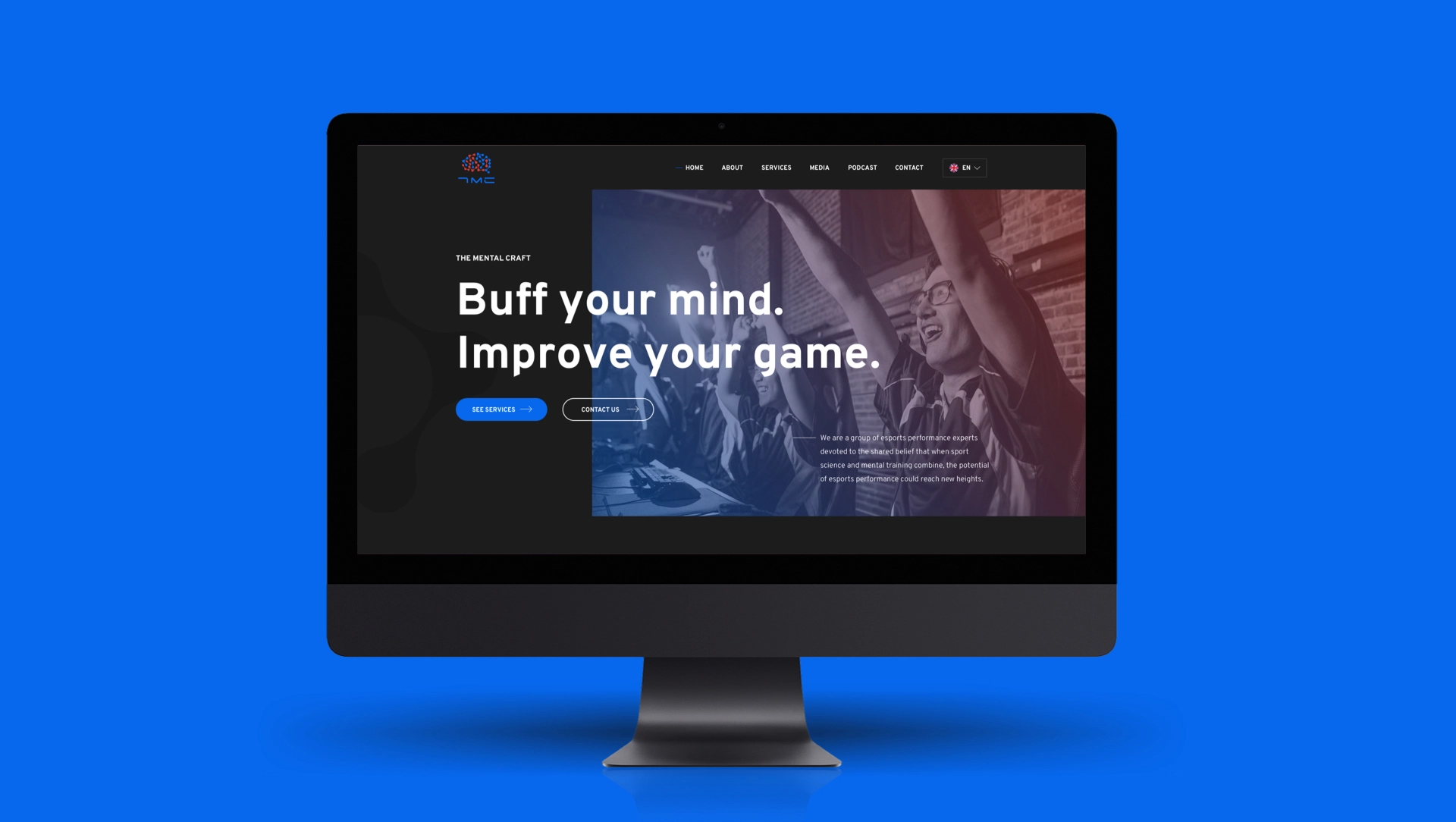
Homepage: A fresh look for gamers
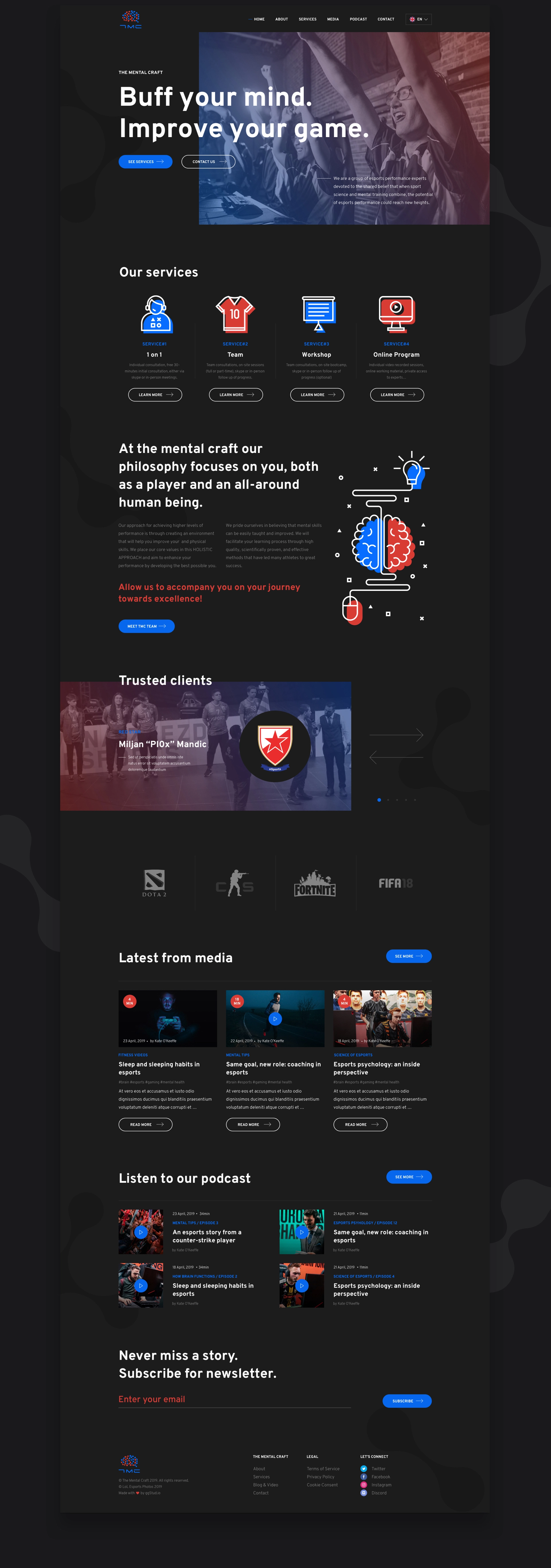
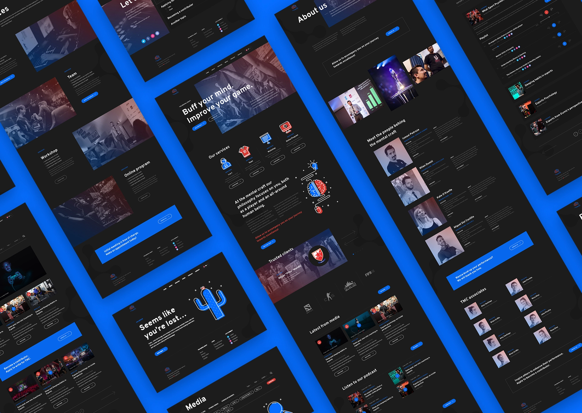
In order to increase the appeal of the whole TMC brand, we improved the functional, strategic, and visual aspects of their website.
- We made a strategy for growing gaming community through blog and podcast as channels for enhancing their online visibility.
- We created design that gamers can identify with. Dark canvas is a surrounding gamers feel confortable in.
- In contrast to it, we used much more vivid shades of blue and red, that already were TMC signature colors.
On top of that, custom icons, illustrations and animations show a strong brand identity.


07
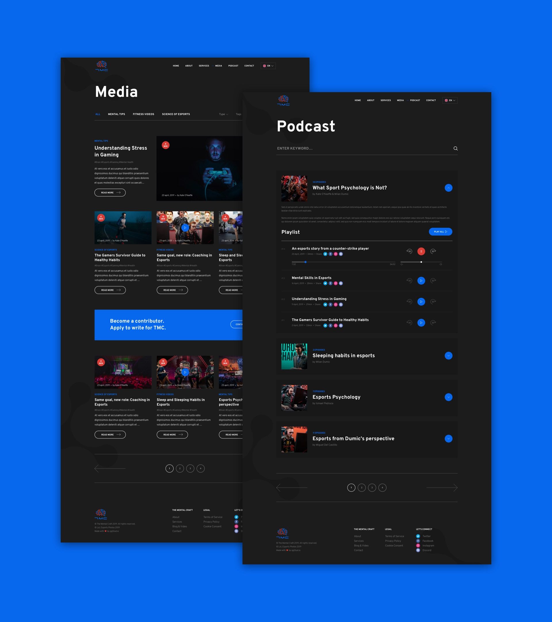
Media & Podcast: A way to educate
Education is really important to TMC. They are eager to write and speak about gaming and share the knowledge, but they constantly have an open call as well for contributors.
That's why we made separate pages for blog and podcast, where gamers can educate themselves through medium that suits them best - either textual or audio.
Since they expect to grow their material on regular basis, we created detailed filters.
08
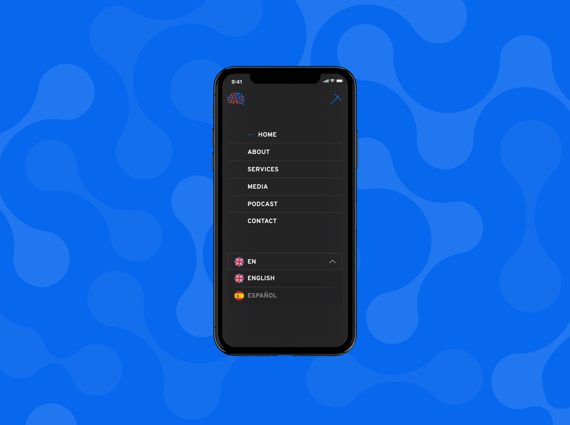
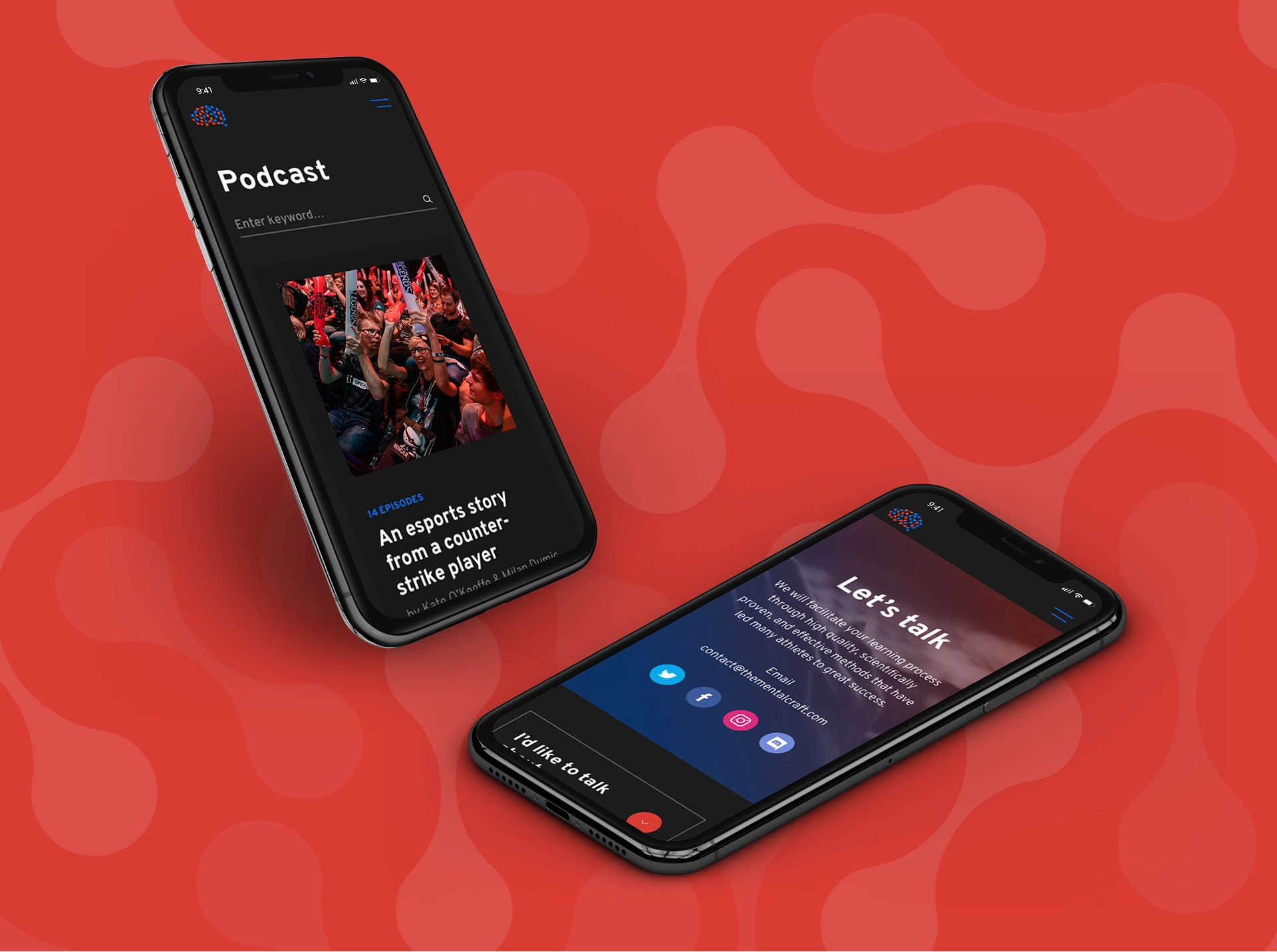
Size matters: Available at all devices
When it comes to screen time, gamers surely break the record. To provide them with the best experience possible at all times, we created a responsive design that fits into every screen.
That way, they can enjoy TMC from the couch and their phone or from the armchair and their laptop. Or any other possible gadget in their home.
As eSports psychologists, we wanted to help both individuals and teams level up their performance by overcoming mental barriers. Gaming and psychology aren't easy to reconcile, but GG studio managed to create a visual identity and website that our audience can relate to. They haven’t missed a single detail. If you need a creative team capable of delivering vibrant brand experiences, GG is right for you.

The Mental Craft
Milan Dumic, CEO
