Mobile Application
Proxfit App
Scope of work
Strategy
UX research
Concepts
Rebranding
Content definition
UX/UI Design
Development
Bahrain-based startup. In the seed-funding phase, they wanted to build an app that connects people who live a healthy life with businesses that support that lifestyle. From-0-to-hero project: Branding, UX, design.
We designed Proxfit mobile app to help people live a healthier life in an easy, fast and accessible way.
01
Challenge #1 and Insight
In the last few decades, people finally started taking their well-being more seriously. From implementing positive habits in everyday lives to changing their mindset.
But parallel to that epiphany, two problems raised:
- a huge number of gyms, spas, healthy food stores…
- lack of time for weeding out the good ones
Our challenge was to find the most efficient way to connect clients with trustworthy gyms, saunas, spas… And every other provider that helps them keep their healthy habits.
All in their proximity.
02
Search function and User defining as the solution
How can we save time to our users, thus preventing them from giving up? It's not easy to change your lifestyle, so every drop of friction might stop you dead in your tracks.
-
We made the process of searching quicker and easier…
By creating highly precise filters and providing only the most relevant information - which are, in this case, services in their direct surroundings.
-
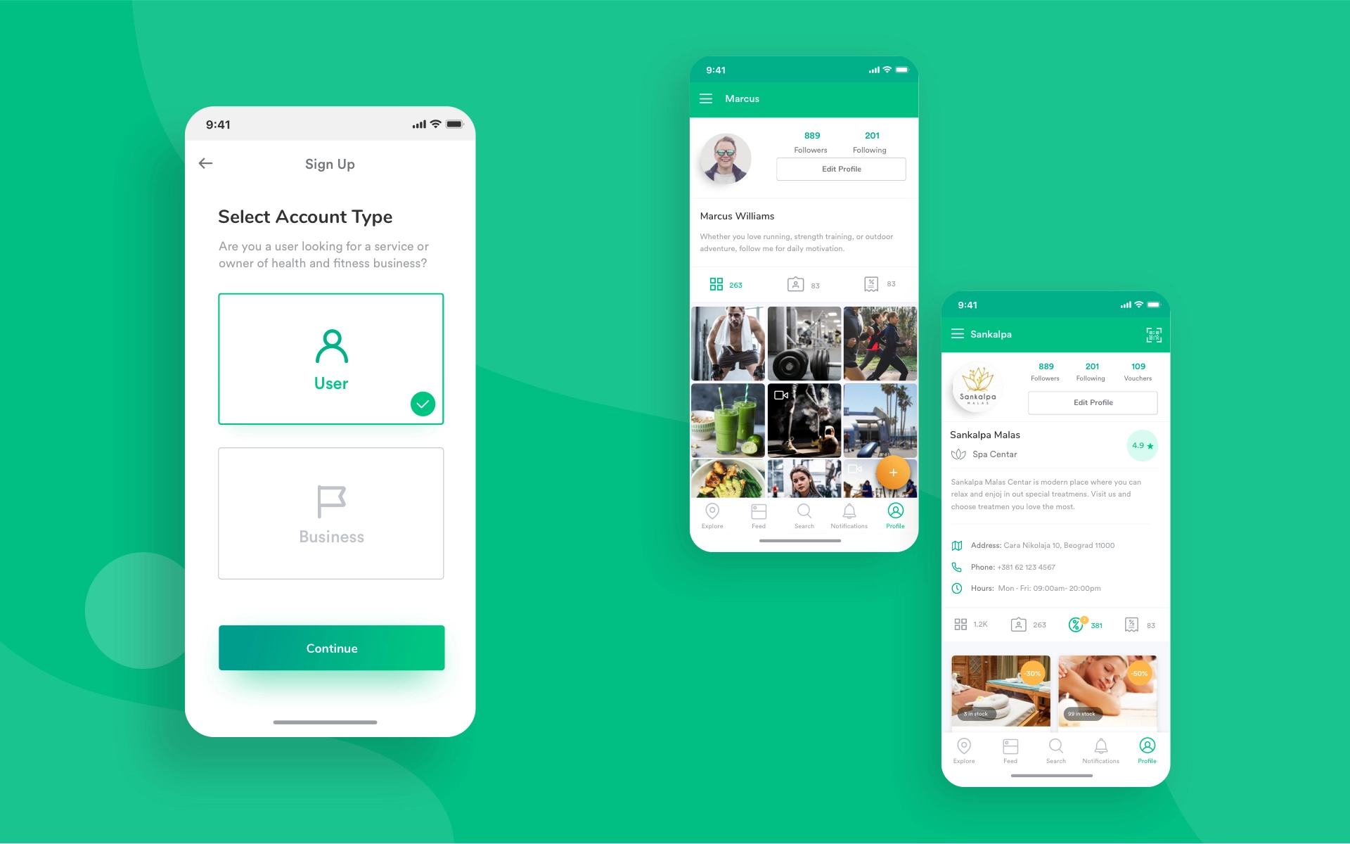
We divided users into 2 groups
The user type 1, called "User" (client) which is a consumer of services and goods, and the user type 2, called "Business", which is the provider of services or goods.
Our goal was to allow them to meet and interact easily.
03
User 1 and how we helped them keep their routine, wherever they are
Nowadays you might often feel like you need an assistant just to pick your information for you. Yes, information overload is real.
With that in mind, we designed an application for the User 1 that sorts out the irrelevant info and gives the essentials.
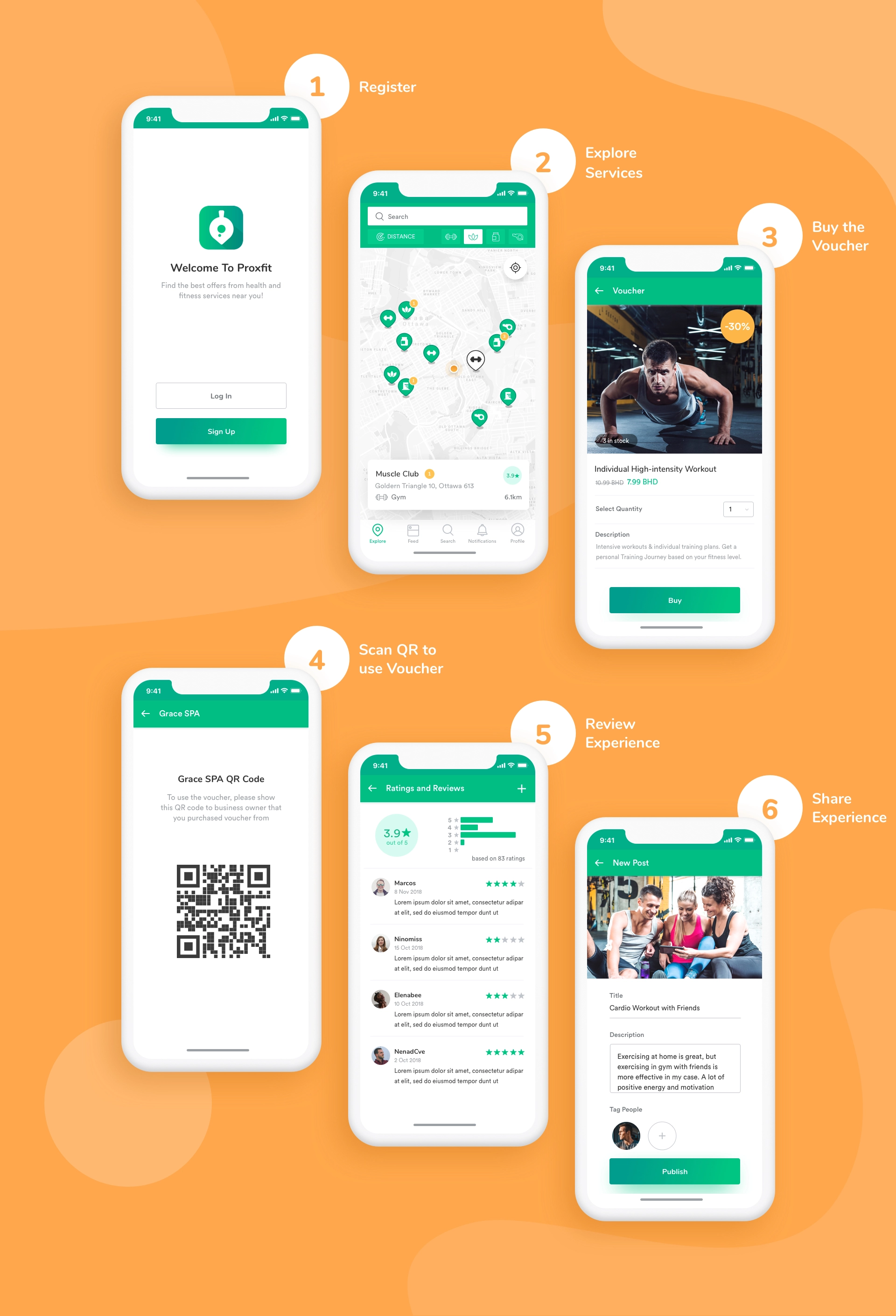
- After they create an account, they only need to permit using their location. The Proxfit app then finds gyms, spas, supplement stores and similar in proximity.
- Additional filters help in narrowing down the search specifically to one category or narrow/broader radius.
- A business trip to a new city? Staying just for a few days? No need to change the routine, thanks to Proxfit. Search for a specific gym from a gym chain, a place to drink a protein shake, spa…
-
The app allows a super easy and quick process of buying and purchasing services thanks to in-app vouchers.
Once the user has found a service provider that suits him, he buys a voucher via the app. When they want to use the voucher, they can simply show it to personnel which will scan a QR code on it.
Since the voucher is stored inside the Proxfit app, this is a great way to use only one application for multiple actions.
- And finally, reviews! Users can leave a review and help others choose quality and reliable services easier.
04
Business users & Marketing through Proxfit
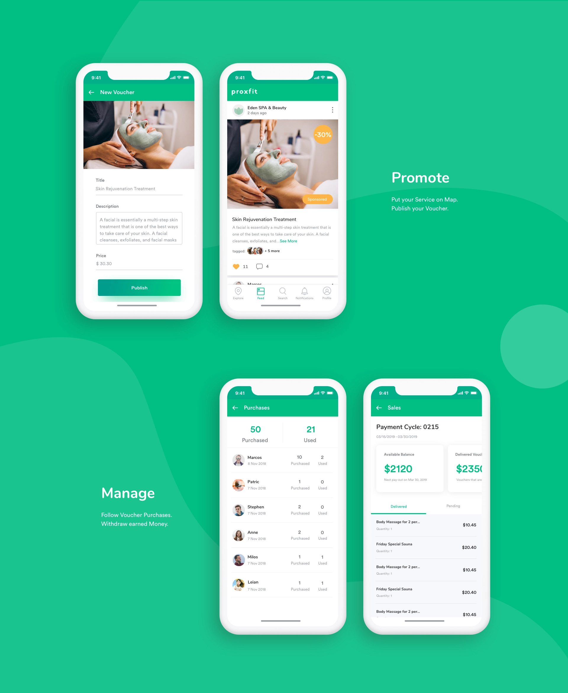
The Proxfit app helps SMBs to save the money they would spend on print material or online campaigns.
They can easily promote their business via Proxfit just by putting it on the map. The better description business owners provide for their services, the more users will they attract.
The higher quality of their services, the better reputation they have to beat the competition.
Our intention was to design an application where businesses would be evaluated transparently, which would make a fair-play atmosphere for SMBs.
Core features:
- Managing profiles and followers
- Analytics on number of users with vouchers and how many of them used them
- Tracking of reviews
- In-app promotion
- Following their balance at any moment and withdraw earned money at the end of the month
05
Direct communication with customers or between users
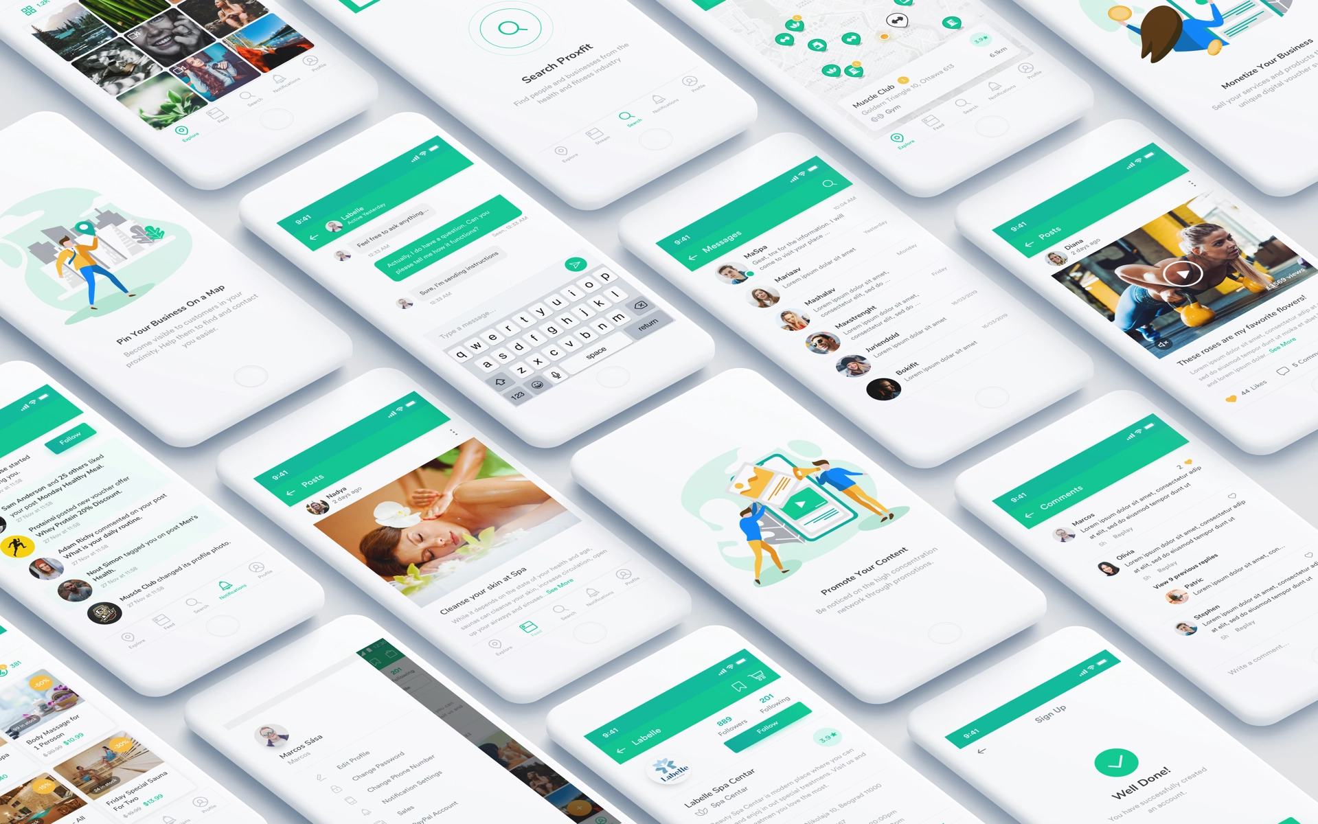
Direct messages allow clients to ask business owners for additional information about service or product they want to purchase.
- Business owners can win a client as soon as they receive a notification. And you’d agree, in the world of chat, it's way more convenient than sending emails, phone calls…
- On the other hand, users can share their experience about a certain business or recommend it after using a voucher.
On the other hand, this can be helpful to other users if they are indecisive while choosing a service for themselves.
Every user of the app can contribute to the community by posting photos, comments, reviews, and rates that are visible to others in social feed called "Stream".
06
Website as the knowledge base or ad platform
The website informs all types of users about the features of the Proxfit app.
Additionally, future users can follow client's reviews about the app to find out if people that are as passionate about health as they find Proxfit useful.
Furthermore, businesses that already use the app can request sponsored posts or pay ads via the website, if they need more boost and promotion.
07
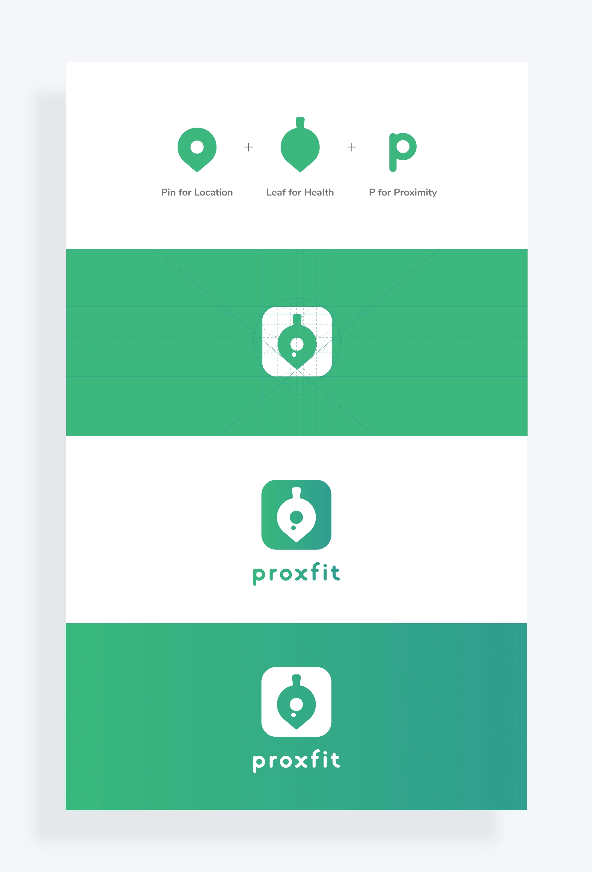
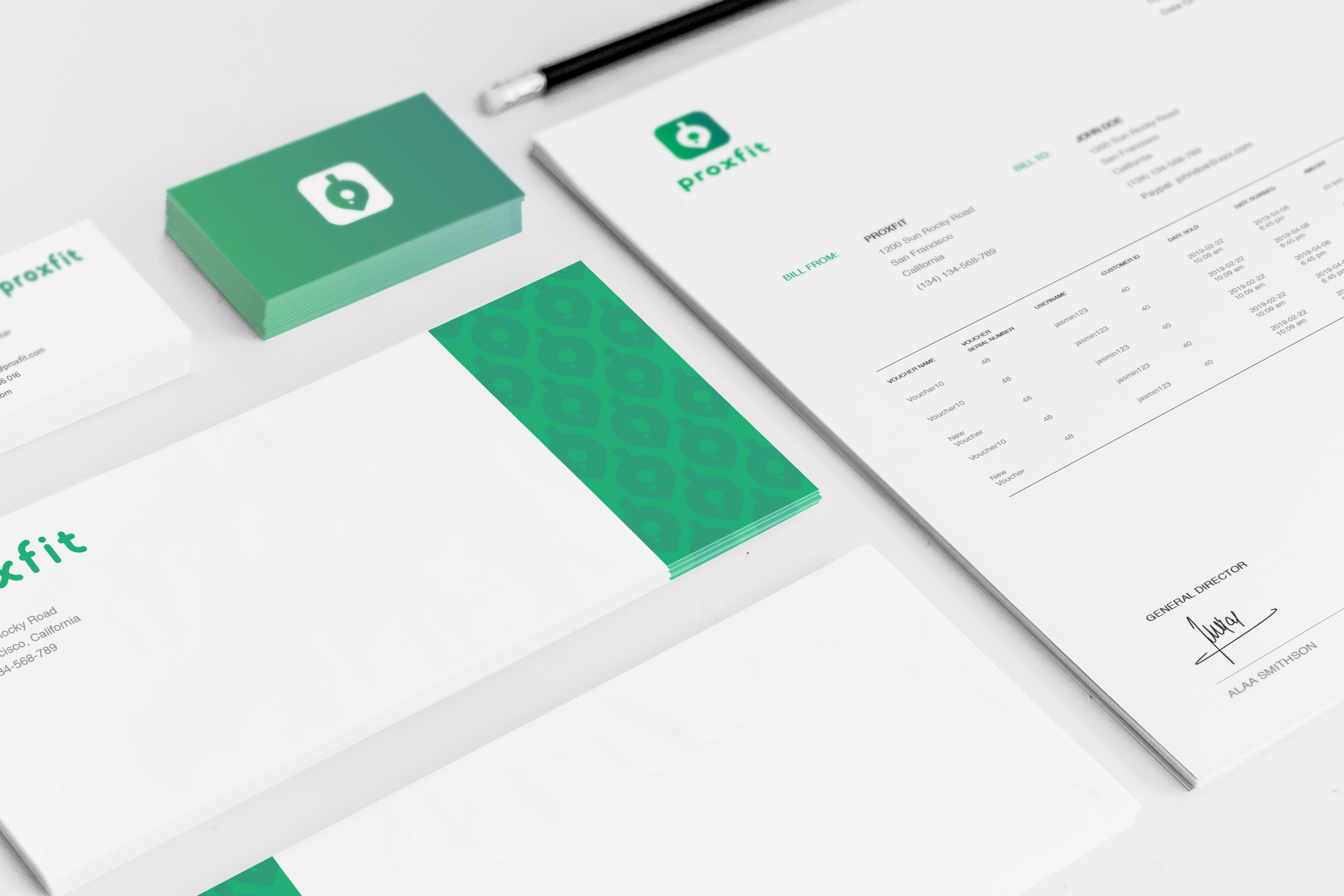
Visual branding that emits health
The Proxfit brand breathes the atmosphere of health, easiness, and lightness.
The logo is a combination of shapes that are directly associated with those characteristics.
- The Pin icon associates to a specific location on the map, while the letter "p" stands for Proximity. These are the symbols of core features.
- A leaf brings in the feel and looks of something young, fresh, and clean since it represents one of the most obvious links to (nature and) health in our mental map.
08
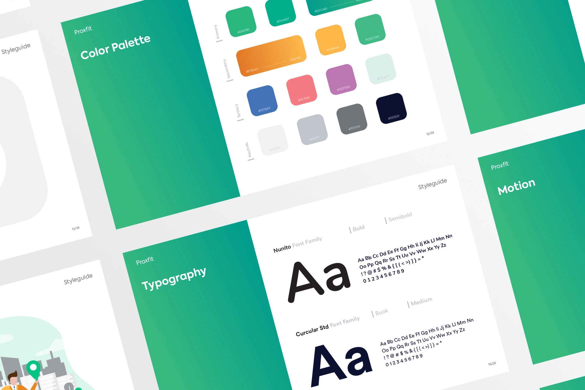
Graphic design that speaks wellness
Every other aspect of our design for Proxfit is wrapped around the feeling of wellness and health.
- Shades of green as the main color came as a logical consequence of that decision.
- Canvas is light since we wanted to create a feeling of easiness for the user while he interacts with either app or print material.
- Big white spacings between elements emits lightness. White space allows the elements to breathe, while the mild shadows gently point out desired item or component.
- We avoided sharp edges and made all the elements soft and rounded to give users an impression of entering a friendly and approachable zone.
- Typography is chosen to be easily legible even in movement from tiny mobile screens since we expect our users to be young, active, and busy.
- Icons as a frequent element of the app blend into this philosophy as well with rounded corners and simple, easily recognizable shape.
- Bright orange is used as a second main color, since it is associated with healthy food as a color of many citruses, but also because it has high visibility and it catches user's attention.
- For the tertiary color palette, we used mild and pastel shades of other colors, but mainly those complementary to the main ones. This palette can be seen in descriptive and funny illustrations that decorate onboarding and splash screens.
From the moment I came across GG studio, I felt they were genuine and down to earth. They provided us with the step-by-step plan and eventually turned our idea into an app and a website that effectively connect active people with fitness service providers in their proximity. What’s more, the visual branding itself breathes the atmosphere of health and ease. Just what we needed.

Proxfit App
Ala Al Danab, founder